Key Takeaways:
• A coxcomb chart inverts the pie. Constant angle, variable radius, which frees the circle to carry a cycle instead of a set of proportions.
• Florence Nightingale invented it to be understood in one glance. Her 850 page report was filed and ignored. A single diagram changed British public health.
• Area is the honest encoding. If the radius is proportional to the value the chart exaggerates. The square root is the correct scaling, and it is the check to run on any coxcomb tool.
• It wins on shape and loses on precision. Choose the coxcomb when the distribution is the message, and a bar chart when the exact comparison is.
• The PowerPoint export is what makes it usable at work. Native editable shapes travel into any deck, while a flat image does not survive the first revision.
Introduction
Some charts changed the way we look at the world. One of them did something else entirely, because it saved thousands of human lives. It is called a coxcomb chart, it was drawn for the first time in 1858 by a nurse working with military mortality data, and it still solves a problem that most people presenting numbers have never framed properly.
This guide covers the whole subject in one place. What a coxcomb chart is and what separates it from a pie chart, where it comes from and why it worked when 850 pages of evidence did not, how to read one without falling into the trap that ruins most modern versions, when it is the right choice and when it is the wrong one, and how to build your own in about a minute with the free coxcomb chart maker I designed for exactly this purpose. Every step carries the screenshot of the screen you will see, so the guide stands on its own even if you never press play. If you would rather watch, the video below tells the story in four minutes.
What is a coxcomb chart
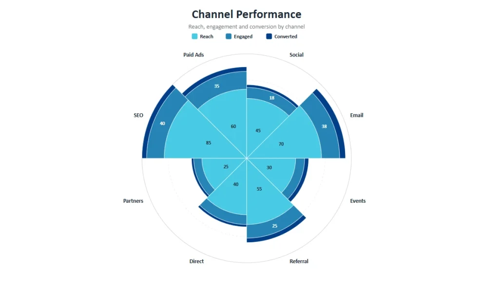
A coxcomb chart is a circular chart in which every category occupies a slice of the same angular width, and the value of each category is expressed by how far its slice extends from the centre. Stack more than one series inside each slice and you obtain a chart that compares magnitudes and composition at the same time, arranged around a circle.
You will find it under several names. Rose diagram, polar area diagram, Nightingale rose chart, coxcomb diagram. They all describe the same object, and the number of names is itself a symptom of how rarely the chart gets used compared to how useful it is.
The difference from a pie chart deserves to be stated precisely, because it explains everything the coxcomb can do that a pie cannot. In a pie chart the angle of each slice carries the value and the radius stays constant. In a coxcomb chart the angle stays constant and the radius carries the value. That single inversion frees the angular dimension, which then becomes available for something far more interesting: a sequence. Twelve months around a circle, four quarters, seven days of the week, eight acquisition channels. The circle stops being a container of proportions and starts behaving like a cycle you can read.
| Chart | Angle | Radius | Best at |
|---|---|---|---|
| Pie chart | Carries the value | Constant | Two or three parts of a whole |
| Bar chart | Not used | Not used | Precise ranking and comparison |
| Coxcomb chart | Constant | Carries the value | Magnitudes inside a cycle, memorability |
The story behind the coxcomb chart
1854, Crimea
British soldiers wounded in the Crimean War were carried to the Scutari hospital in Istanbul. Florence Nightingale walked into that hospital for the first time at thirty four years old and found conditions that had nothing to do with the injuries the men had arrived with. No air circulating, no space between the beds, no cleaning worth the name.
She started with measures so basic they sound trivial today. Open the windows. Space the beds. Wash the floors. Mortality collapsed, and the reason it collapsed is the finding that mattered: soldiers were dying of preventable disease at a rate that dwarfed the deaths caused by their wounds.
The 850 pages nobody read
Back in Britain, Nightingale understood that saving the soldiers in front of her was the smaller half of the problem. The knowledge had to travel. So she compiled her findings into a report of roughly 850 pages and sent it to the institutions that could act on it.
The report became famous, and not for the reason she intended. Bureaucrats thanked her politely, replied with courteous letters, and filed it. It was too long, too dense, too heavy to read. The evidence was all there and it was reaching nobody. Anyone who has ever watched a rigorous, well researched deck die in a meeting room knows exactly what that feels like.
One chart, one message
At some point she stopped trying to make people read the report and asked a different question: what would it take for a person to understand the finding in a single glance? Her answer was a diagram in which each wedge represented a month of the campaign, and each wedge was split by cause of death.
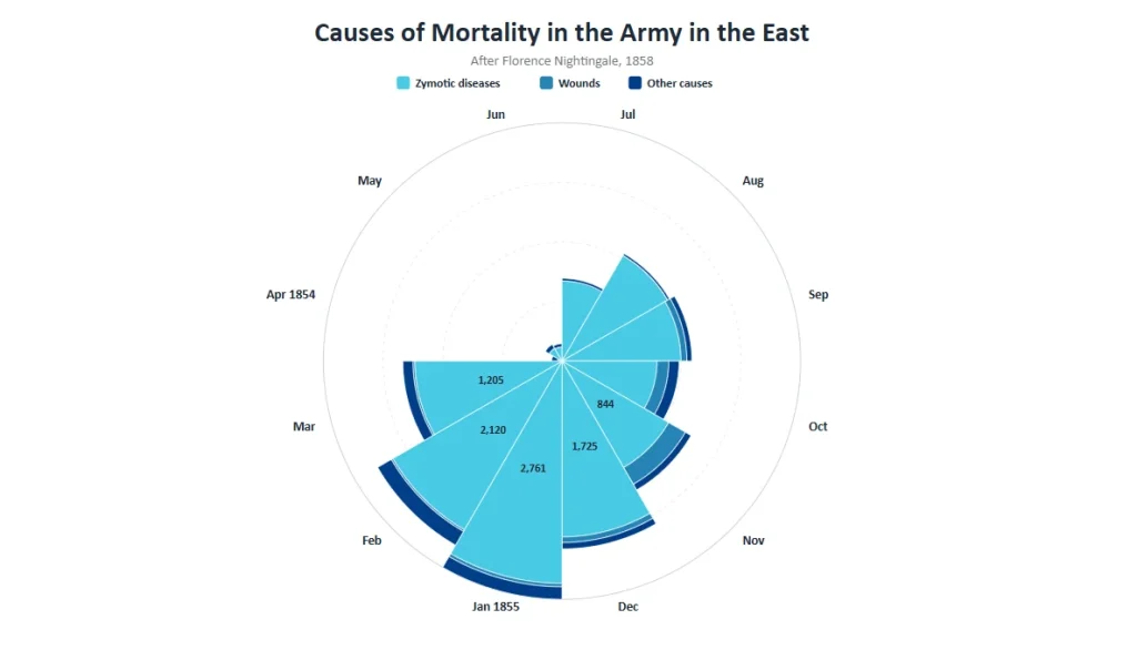
The chart made the argument in the time it takes to look at it. Politicians understood it, institutions acted on it, and the sanitary practices rolled out well beyond military hospitals and into civilian ones. The data had not changed. The encoding had.
How to read a coxcomb chart, and the mistake most versions make
Reading a coxcomb chart is straightforward once you know where to look. Every slice is a category or a period and always occupies the same angular width, so the eye is free to compare how far each one reaches. Stacked series build outwards, which means the outer bands sit on top of the inner ones and the total distance from the centre represents the sum.
The mistake sits one level deeper, and it is common enough to deserve a section of its own. When the radius of a wedge is set directly proportional to the value, the area of that wedge grows with the square of the value. A category worth twice another one ends up covering four times the surface, and since the eye judges these shapes by area rather than by radius, the chart exaggerates by a factor that grows with the numbers involved.
Nightingale did not make that mistake in 1858. Her wedges were scaled so that the area, rather than the radius, was proportional to the value. The chart maker I built does the same, computing the radius as the square root of the value so that the visible surface stays honest. If you ever evaluate another coxcomb implementation, that is the single check worth running before you put it in front of an audience.
When a coxcomb chart is the right choice
The coxcomb earns its place when the data has a cyclical or naturally circular structure and you want magnitudes compared inside that cycle. Monthly seasonality across a year, hourly distribution across a day, wind direction, performance across a fixed set of channels that has no meaningful ranking. It also earns its place when the chart itself has to be memorable, because a well built rose is one of the very few chart types people remember having seen.
It is the wrong choice when precision of comparison is the point. If your audience has to rank ten values accurately, a bar chart will beat a coxcomb every time and no amount of craft will close that gap. It is also the wrong choice for a single series of unordered categories, where you would be paying a comprehension cost purely for decoration, and for values with a very wide range, where the smallest wedges become invisible.
I use a simple rule. If the story is the shape of the distribution, the coxcomb wins. If the story is the exact difference between two numbers, it loses. The same logic runs through everything I have written about data storytelling and about making data persuasive: the chart type is a rhetorical decision before it is a technical one.
How to build a coxcomb chart in about a minute
Building this chart by hand in PowerPoint is a genuinely painful exercise, and that is the reason most people who would benefit from it never make one. So I built a free tool that does the work and hands you back a native PowerPoint file at the end. No account, no watermark, no export limit.
Open the MLC Free Coxcomb Chart Maker in a second tab and follow along. Every step below matches what you will see on your screen.
Step 1. Open the chart maker
The interface splits in two. Data on the left, live preview on the right. Everything you change on the left redraws immediately on the right, so there is no render step and no waiting.
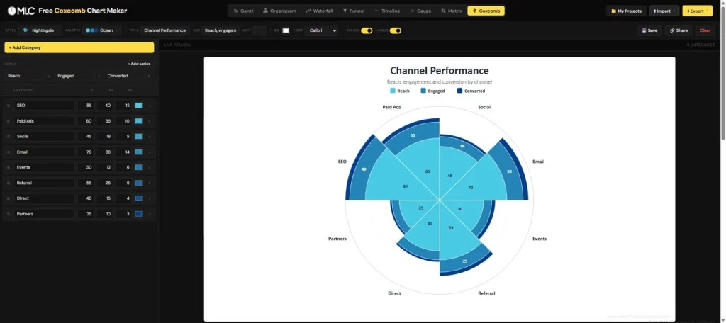
Step 2. Enter your categories and your series
Each row is a category and becomes one wedge of the rose. Each column is a series and becomes one band inside every wedge. Add categories with the yellow button, add series with the control above the table, and drag the handle on the left of any row to move that wedge around the circle.
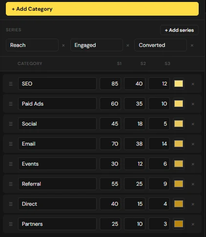
The order of the rows is the order around the circle, starting at the top and moving clockwise. When your categories represent time, keep them chronological and the chart will read as a cycle instead of a ranking.
Step 3. Import your data instead of typing it
If the numbers already live in Excel, Google Sheets or a CSV, paste them straight in. The importer expects one column of categories followed by one column per series, one category per row.
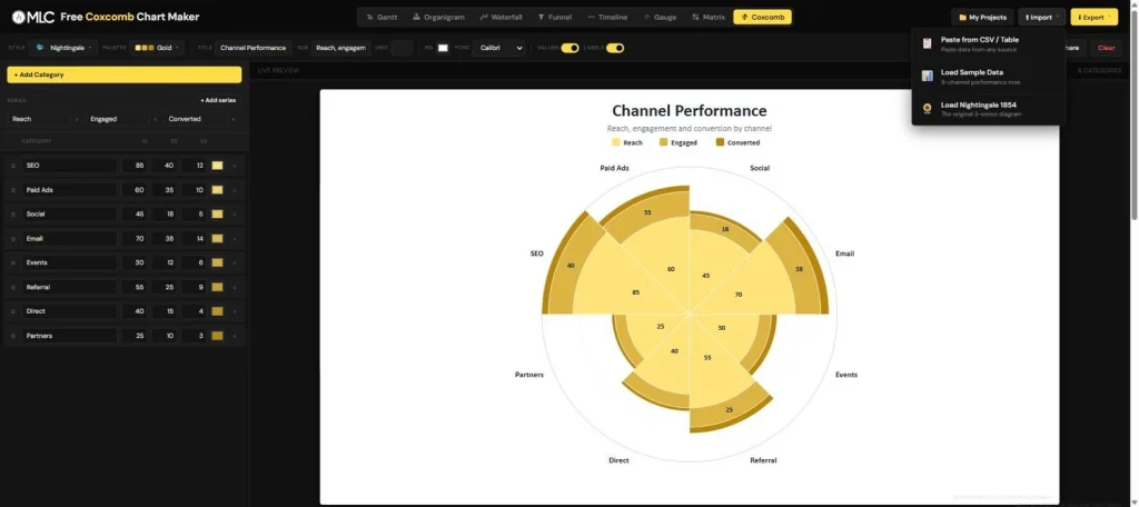
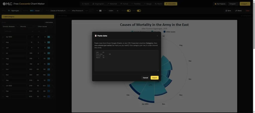
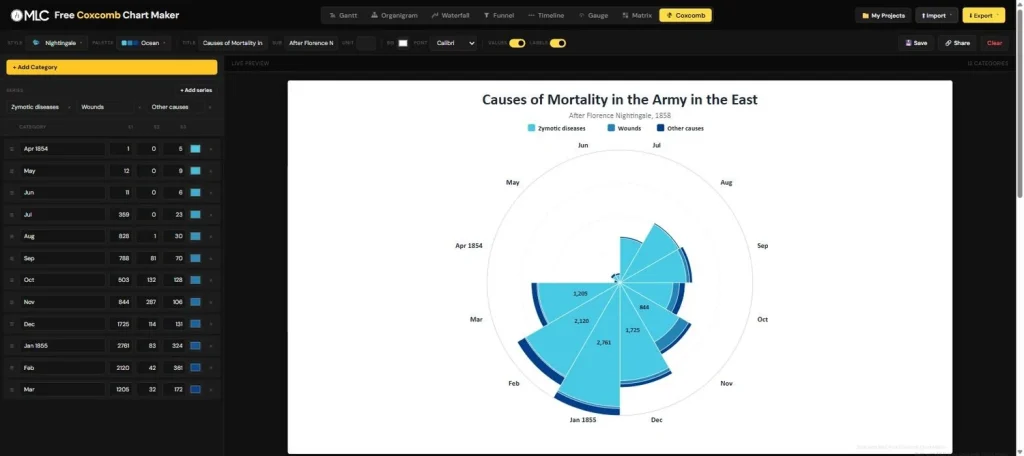
The same menu carries two ready made datasets. One is a sample eight channel performance rose, useful for exploring the options without preparing anything. The other is the original Nightingale data from 1854, which is the fastest way to see what this chart looks like when it is doing the job it was invented for.
Step 4. Choose the style
Six styles ship with the tool, and they change the personality of the chart considerably while leaving the data untouched.
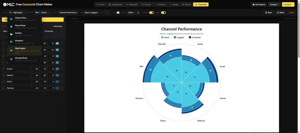
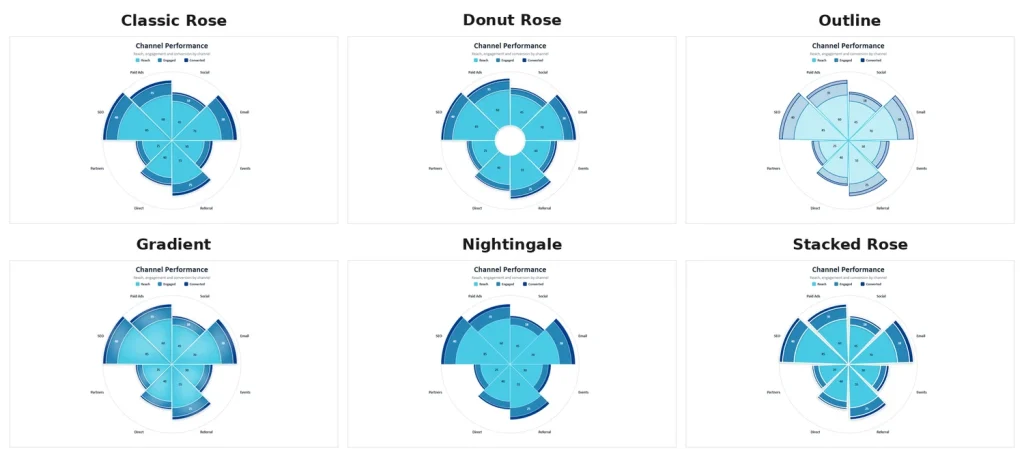
Classic Rose gives full wedges from the centre. Donut Rose opens a hole in the middle, which helps when the smallest values would otherwise collapse into an unreadable point. Outline keeps light fills and crisp borders, and it is the one that survives best on a printed page or a projector with poor contrast. Gradient adds depth. Nightingale reproduces the contiguous wedges and hairline splits of the 1858 original. Stacked Rose separates the wedges with bold splits and reads well when the categories are independent of one another.
Step 5. Match your brand colours
Twelve palettes are available, from Ocean to Corporate to Mono, and each one recolours the whole chart in a click.
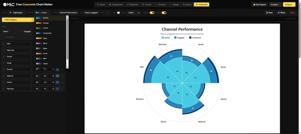
If you need something more specific, every row carries its own colour swatch, so you can override individual wedges on the single series styles and match a corporate palette exactly.
Step 6. Set the titles and the typography
The toolbar carries the title, the subtitle, the unit that appends to every value, the background colour and the font.

Two fields in this row decide more than they appear to. The unit is what turns a bare 85 into 85% or 85k, and a chart whose numbers carry no unit invites exactly the question you did not want during your presentation. The font selector should be set to whatever your deck already uses, so that the exported chart lands on the slide without a typographic seam.
Step 7. Decide what the audience sees
Values and labels each have their own toggle. Switching the values off leaves the pure shape of the distribution.
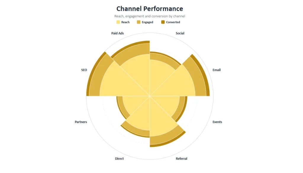
This is a rhetorical choice rather than a technical one. Keep the values when the audience will be asked to interrogate the numbers, and drop them when you want the shape to land in a single glance and the figures to live in the appendix. Nightingale’s own diagram carried very few numbers, and that was not an accident. It is the same principle I explore in neuro presentation design: what you remove is what makes the rest visible.
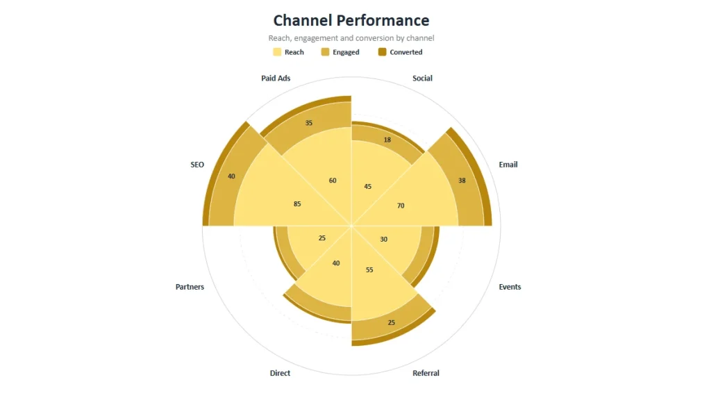
Step 8. Export to PowerPoint
Three export formats are available. PowerPoint, image and Excel.
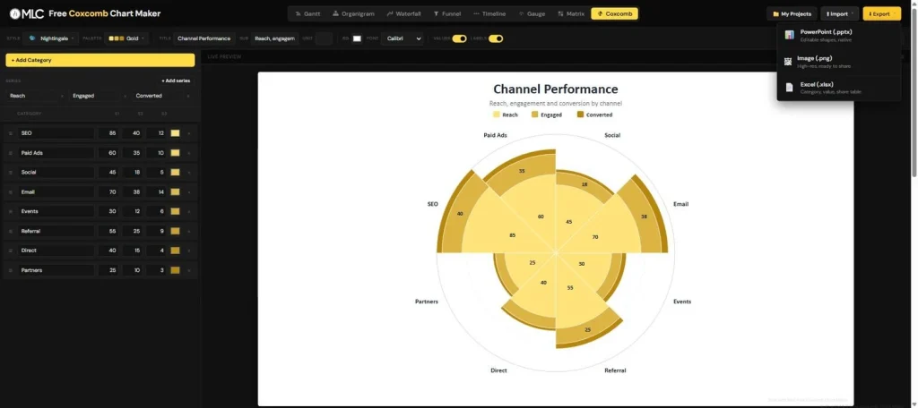
The PowerPoint export is the reason the tool exists. What lands on your slide is not a picture of a chart. It is a group of native PowerPoint shapes: wedges, labels, legend and title, all editable, all recolourable, all movable.
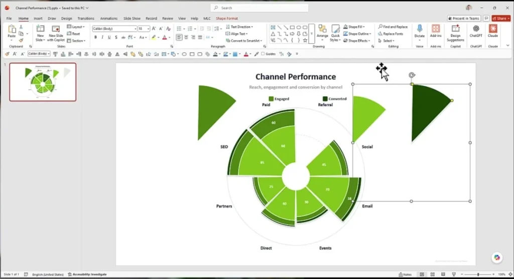
That distinction has a practical consequence worth spelling out. Anyone you send the deck to can open it, pull a wedge out to emphasise it, restyle it to their own template or fix a typo in a label, and none of them needs this tool, an add-in or an account to do it. The chart behaves like something that was drawn in PowerPoint, because in every sense that matters to the person receiving it, it was.
The Excel export gives you the underlying table with category, value and share, which is what people ask for in the follow up email roughly every single time.
Step 9. Save your work and share it
Save keeps the project available so you can return to it, and Share produces a link that opens the chart with its data already loaded, which is the fastest way to hand a colleague something they can edit instead of something they have to rebuild.
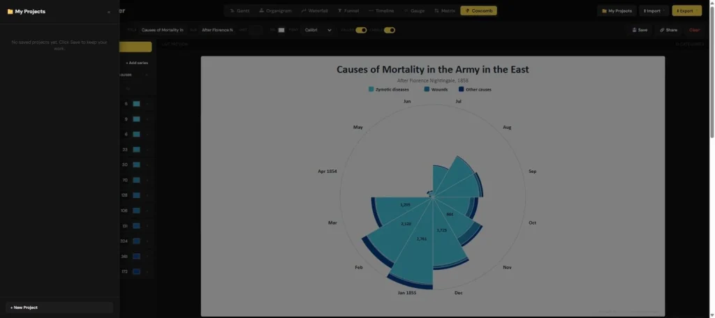
Bonus. Load the 1854 dataset
If you want to understand this chart properly, load the original data and look at the editor and the preview side by side. Twelve months down the left, three causes of death across, and on the right the shape that changed British public health.
The coxcomb is one of eight chart builders on the same platform. If your data does not belong in a rose, the Gantt, waterfall, funnel and timeline makers all export to PowerPoint the same way.
Conclusion
Five things are worth carrying away from this guide.
- The coxcomb inverts the pie. Constant angle, variable radius, which frees the circle to represent a cycle instead of a set of proportions.
- Area is the honest encoding. If the radius is proportional to the value, the chart exaggerates. The square root is the correct scaling, and it is what Nightingale used in 1858.
- The chart type is a rhetorical decision. Choose the coxcomb when the shape of the distribution is the message, and a bar chart when the exact comparison is.
- Order carries meaning. The sequence of your rows becomes the sequence around the circle, so chronological data should stay chronological.
- A native export is worth more than a beautiful image. A chart your audience can edit survives contact with the real world. One that arrives as a flat picture does not.
Nightingale had the data and the argument for years before anything changed. What changed things was giving that argument a shape a person could absorb in a single glance. That is still the job, and it is still the part most decks skip.
A checklist to keep open
- Put the categories in the order you want them read around the circle
- Check that the tool scales by area before you trust the shape
- Set the unit before you export, not after the first question from the room
- Match the font to the deck the chart is going into
- Use Outline or Donut Rose when the smallest values risk disappearing
- Switch the values off when the shape is the message
- Export to PowerPoint rather than to an image whenever someone else will edit the deck
- Save the project before you close the tab, and share the link instead of the screenshot
So what is the first dataset you would put into a rose? If you have a set of numbers sitting in a table that nobody reads, that is exactly the material this chart was invented for. Build your first coxcomb chart and tell me in the comments how it went.
FAQ: Frequently Asked Questions
What is a coxcomb chart?
A coxcomb chart is a circular chart in which every category occupies a slice of equal angular width and the value is expressed by how far that slice extends from the centre. It is also known as a rose diagram, a polar area diagram or a Nightingale rose chart, and it was popularised by Florence Nightingale in 1858 to show the causes of mortality in the British army during the Crimean War.
What is the difference between a coxcomb chart and a pie chart?
In a pie chart the angle of each slice carries the value and the radius is constant. In a coxcomb chart the angle is constant and the radius carries the value. Because the angular dimension is freed, a coxcomb can arrange categories as a cycle, twelve months for example, and still compare their magnitudes.
Why is it called a coxcomb chart?
The name comes from the resemblance between the diagram and the crest of a rooster, the coxcomb. Nightingale herself used the word for the publication the diagram appeared in rather than for the chart, and the label attached itself to the chart over time. Rose diagram and polar area diagram are the more descriptive alternatives.
How do I create a coxcomb chart in PowerPoint?
PowerPoint has no native coxcomb chart type, so the practical route is to generate the chart outside PowerPoint and export it as native shapes. The free MLC Coxcomb Chart Maker does this: you enter or paste your data, choose a style and a palette, and export a pptx file in which the wedges, labels and legend are standard editable PowerPoint objects.
Can I create a coxcomb chart in Excel?
Not directly. Excel has no coxcomb or polar area chart type, and the workarounds that circulate rely on stacked radar charts or on manually drawn shapes, both of which are fragile and slow. Building the chart in a dedicated tool and exporting it takes about a minute instead.
Is the MLC Coxcomb Chart Maker free?
Yes. It runs in the browser, it requires no account, and the PowerPoint, image and Excel exports carry no watermark and no limit.
When should I avoid a coxcomb chart?
Avoid it when your audience needs to rank values precisely, because a bar chart communicates that far more accurately. Avoid it also for a single series of unordered categories, and for datasets with a very wide range of values, where the smallest wedges become impossible to see.


Comments on Coxcomb Chart: the complete guide to the chart that saved thousands of lives (and how to build one in seconds)