The whole sequence, from the table to the finished slide, runs under three minutes.
Key Takeaways:
• The expensive part of AI is not the prompt, it is the iteration. Every round you spend explaining what you actually meant costs more than the time the tool saved you, and it costs more the slower the model is.
• You usually know the content, not the design. That gap is exactly what Copilot fills with a guess, and a guess is what produces a slide that could belong to anybody.
• A template closes the gap before you type. Choosing the layout first turns an open creative question into a filling exercise, which is the kind of task AI is genuinely good at.
• Copilot will evolve a template, not just populate it. The template carried five milestones and the table carried seven. Copilot extended the structure and kept the visual language intact.
• What is left over is judgement. Alignment, icon treatment, what deserves emphasis: that part stays yours, and it is the part that is worth your time.
The real cost of an incomplete prompt
When we work with artificial intelligence we usually know what we want to obtain. We rarely know it at one hundred per cent. That difference sounds small, and it is not: it is the reason we write incomplete prompts, get mediocre results back, and start iterating.
Every iteration costs. It costs downstream, after you have already committed to the approach, and it costs more when the model takes longer to process each round. The irony is familiar to anyone who has tried to design a slide this way: you open Copilot to save fifteen minutes and you spend twenty-five explaining what you actually meant.
The fix is not a longer prompt. It is giving the AI a direction before you ask it for anything.
The starting point: a table that should have been a timeline
Here is the concrete case. A deck with a table on slide 2: seven rows, three columns, the milestones of artificial intelligence from the Dartmouth Conference in 1956 to ChatGPT in 2022. Year, event, and a short description for each.
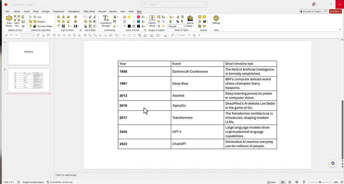
It is perfectly readable and completely wrong for the job. This is chronological content, and chronological content wants to be seen as a sequence, not parsed as a grid. It should be a timeline.
So the obvious move is to open Copilot and type convert this into a timeline.
Why “convert this into a timeline” is the wrong prompt
That prompt will work. It will give you a timeline. It will not give you your timeline, and the reason is not that Copilot is weak. It is that you have not decided anything yet.
Ask yourself what the model has to invent to answer that request: the orientation, the layout, how the milestones are spaced, whether there are icons and in what style, which colours, how the dates are treated, how much text each step carries. Every one of those invented decisions is a decision you did not make, and every decision you did not make is a future iteration waiting to happen.
I do not always know which timeline I want. But I do know that I want one that matches my brand guidelines. That is enough to work with, and it changes the whole approach.
Step 1. Choose the template before you open Copilot
Instead of describing a design in words, go and pick one. I use the MLC assets portal, which collects the images, icons, diagrams and editable PowerPoint templates we build for presentation work.
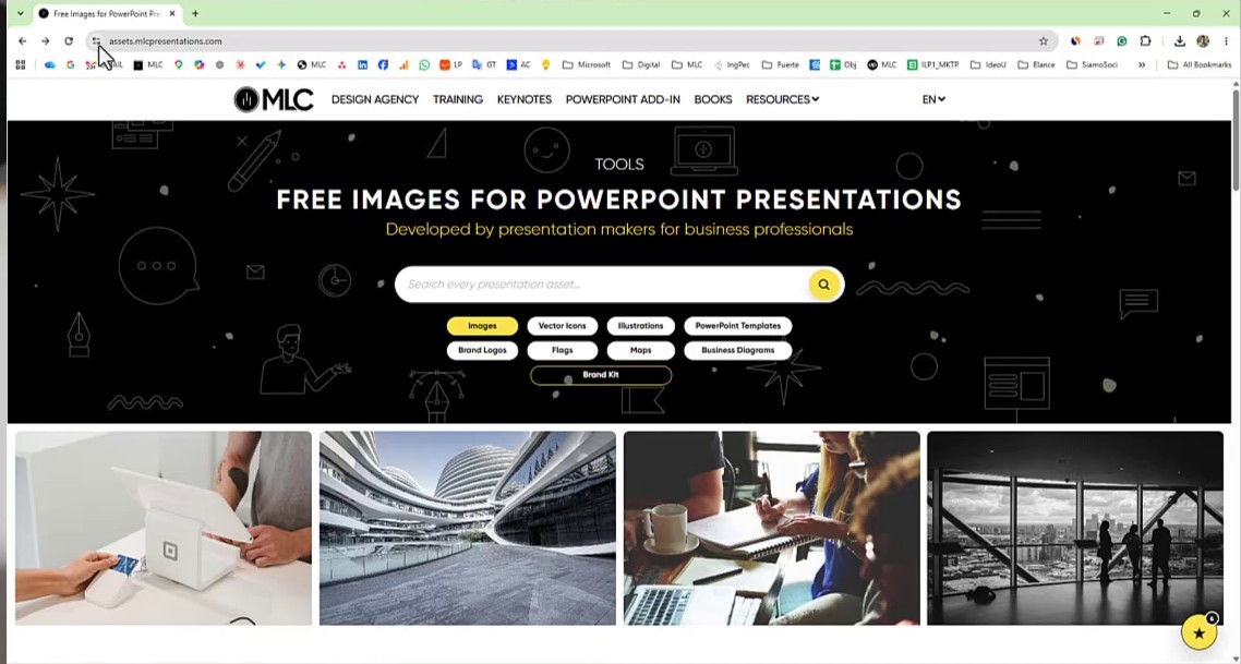
From there, open the PowerPoint templates section and filter for Timeline. You get a gallery of timeline layouts, each one already built as an editable PowerPoint object rather than a flat image.
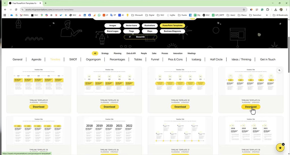
Scroll, choose the one that fits your case and your brand, and download it. This takes about thirty seconds, and it is the single most valuable thirty seconds in the whole workflow.
Step 2. Bring the template into your deck
Open the downloaded file, copy the timeline, and paste it into your presentation. In this case it becomes slide 3, sitting right after the table it is going to replace.
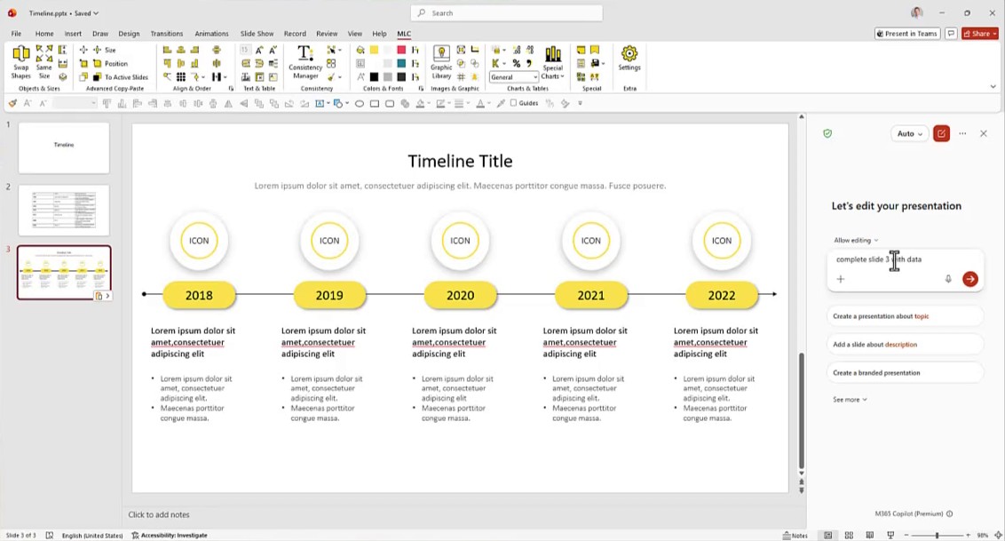
Now notice the mismatch, because it matters. The template carries five milestones. The table carries seven. Do not fix that by hand. Leave it exactly as it is and let the next step handle it, because how the model deals with that gap tells you something important about what a template actually is to an AI.
Step 3. Write the prompt that points at the template
This is the prompt I used, exactly as typed:
fill the timeline at slide 3 with the data from slide 2 make sure no data is lost. Basically you are using the template at slide 3 plus icons you will generate to illustrate the contents of slide 2
It is not elegant. It does three things that matter:
- It points at the structure. Slide 3 is not a suggestion, it is the container. The design question is closed before the model starts working.
- It points at the source. Slide 2 is where the content lives. The model is not being asked to invent facts, only to move them.
- It sets a hard constraint. Make sure no data is lost is the line that stops the model from quietly dropping two rows to make seven items fit a five-item layout.
Adding that you want the result to stay consistent with your branding costs you four words and saves you a round trip.
Step 4. What Copilot did with the template
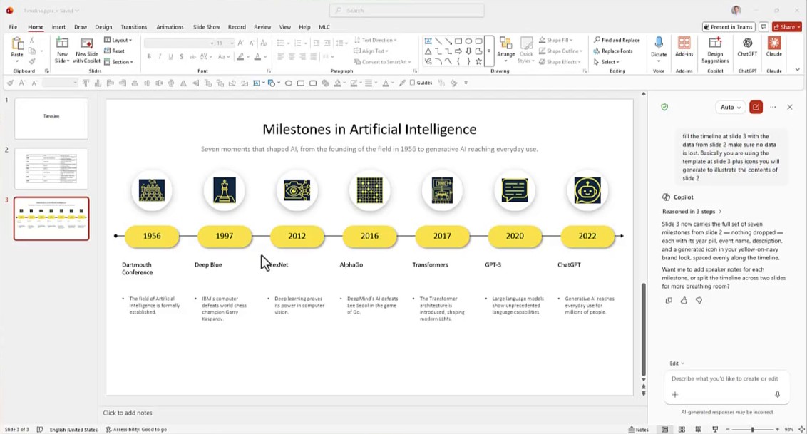
Copilot reported back:
Slide 3 now carries the full set of seven milestones from slide 2 — nothing dropped — each with its year pill, event name, description, and a generated icon in your yellow-on-navy brand look, spaced evenly along the timeline.
This is the interesting part, and it is worth being precise about it. Copilot did not stop at five and drop the last two milestones. It did not squeeze seven items into five slots. It extended the template to seven steps, kept the year pills, kept the spacing logic, kept the visual language, and generated an icon for each milestone in the deck’s colour scheme.
The template was read as a direction, not as a cage. That is the behaviour you are paying for when you supply one, and it is the behaviour you never get from convert this into a timeline.
Step 5. Fix what Copilot cannot judge
The slide is not finished. The text needs work on alignment, and the generated icons came back sitting on solid black backgrounds, which fights with the rest of the deck.
You do not fix that one icon at a time. Select all seven, and notice that Copilot acknowledges the selection in the panel: 7 Objects selected. It knows what you are pointing at.
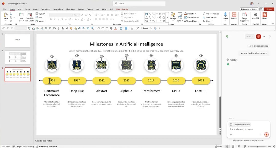
Then the whole instruction is four words:
remove the black background
And the answer:
The dark backing is gone — the icons now sit transparently on the white circles, with the line art deepened slightly so it still reads clearly against white.
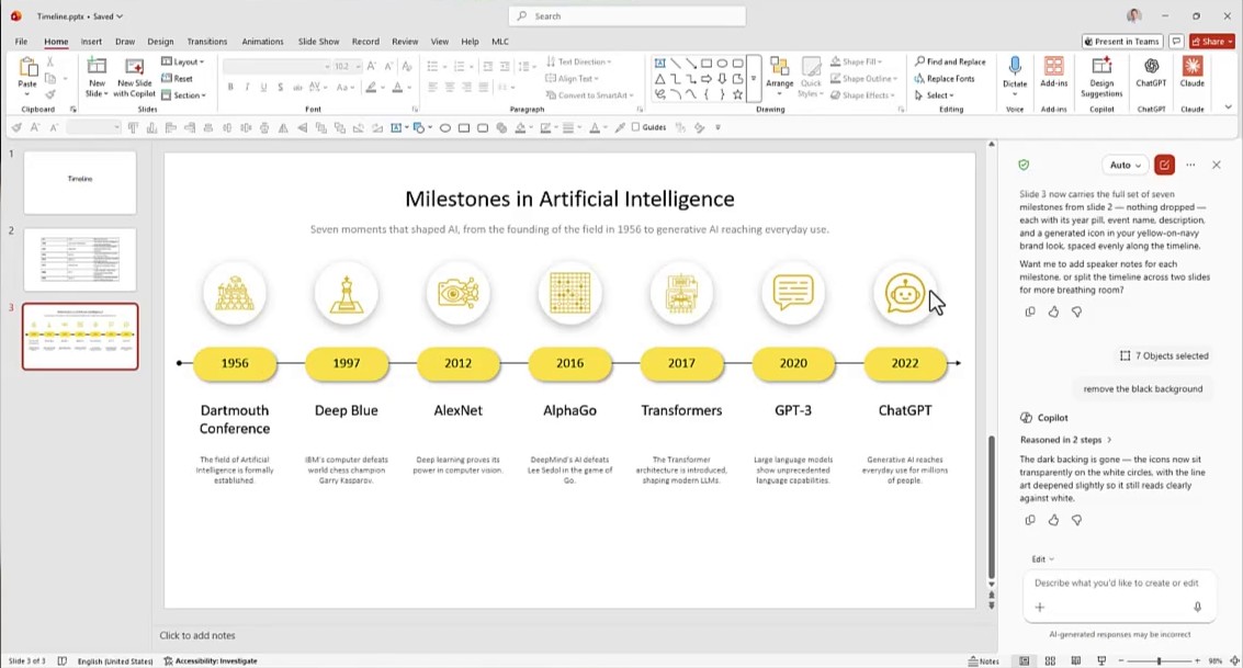
Note that it did not simply delete the background. It also deepened the line art so the icons would still read against white. That is a second-order adjustment, and it is the kind of thing that makes the difference between a slide you have to redo and a slide you can present.
Copilot is powerful, but it is never autonomous
Copilot keeps getting better, and it is increasingly sitting next to the person doing the work in PowerPoint rather than off to one side. That is real progress and it is worth using.
It is also not independent. Like every AI tool, it needs to be guided. Which means the useful question is not what can Copilot do but what do I need to have ready so that Copilot can do it well. A branded template is one of those things. So is a clean source table. So is knowing, before you type, which decisions you are willing to delegate and which ones you are not.
We should use AI to expand our capabilities, not to replace ourselves. Our judgement and our experience remain the real added value in this process.
Why a template is a synthesis of experience
There is a catch in that last sentence, and it is worth saying out loud: we have limits too. We do not always know everything. Sometimes the reason the prompt is incomplete is not laziness, it is that we genuinely have not decided what good looks like yet.
Which brings us to the question underneath this whole workflow. What is a template, really?
A template is a synthesis of experience. It is a set of design decisions that somebody already made, tested, and resolved: spacing, hierarchy, how many items fit before the eye gives up, how a date should be treated, where the emphasis goes. When you hand one to Copilot you are not just giving it a picture to copy. You are giving it the compressed output of work that has already been done.
That is why the approach works. You use Copilot to save time. You use the template to make experience count.
Conclusion
The workflow fits in five lines:
- Decide the layout before you open the AI panel.
- Bring the template into the same deck as the content.
- Point the prompt at both: the structure and the source.
- Add the constraint that protects your data.
- Keep the judgement calls for yourself.
If you want to go deeper on what Copilot can and cannot do inside PowerPoint, the complete guide to creating PowerPoint presentations with Microsoft Copilot covers the wider picture, and the walkthrough of the Copilot Skills in PowerPoint shows what happens when you let the built-in skills drive instead. If your interest is the timeline itself rather than the AI, how to create a timeline in PowerPoint covers the manual techniques in full, and eight PowerPoint productivity workflows puts this kind of task into a wider routine.
Good work, and good presentations.
FAQ: Frequently Asked Questions
Can Copilot in PowerPoint use my own template?
Yes, as long as the template is on a slide inside the same presentation Copilot is working in. Paste it into the deck, then reference it by slide number in the prompt. Copilot reads the slides of the open presentation, so a template sitting in a separate file is invisible to it.
What happens if my template has fewer steps than my data?
Copilot will extend the template rather than discard the extra content, provided you tell it not to lose anything. In the case shown here the template had five milestones and the table had seven, and Copilot rebuilt the timeline with all seven while keeping the original spacing and visual style. Without the explicit instruction, dropping rows to fit the layout is a real risk.
How do I convert a table into a timeline in PowerPoint with Copilot?
Put the table on one slide and a timeline template on another, then ask Copilot to fill the template slide with the data from the table slide, adding that no data should be lost. Naming both slides explicitly is what separates a usable result from a generic one.
Why does Copilot generate icons with a black background?
Generated icons often come back on a solid backing rather than transparent. Select all of them at once, confirm that the Copilot panel reports the number of objects selected, and ask it to remove the black background. It will also adjust the line art so the icons stay legible on a light surface.
Where can I find free editable PowerPoint timeline templates?
The MLC assets portal has a PowerPoint templates section with a dedicated Timeline category. The templates are editable PowerPoint objects, not images, which is what makes them usable as a structure for Copilot to fill.
Is it faster to use a template than to iterate on prompts?
In most cases yes. Choosing a template takes around thirty seconds and removes the design decisions the model would otherwise have to guess. Each guess that turns out wrong costs a full iteration, and iterations get more expensive the slower the model is at processing the deck.


Comments on Copilot PowerPoint template: how to turn a table into a timeline without iterating