KPI Dashboard Template
Put your KPIs on one dashboard slide. Open this gauge template, set each metric against its target, and export an editable PowerPoint chart.
Open this template → or start from scratch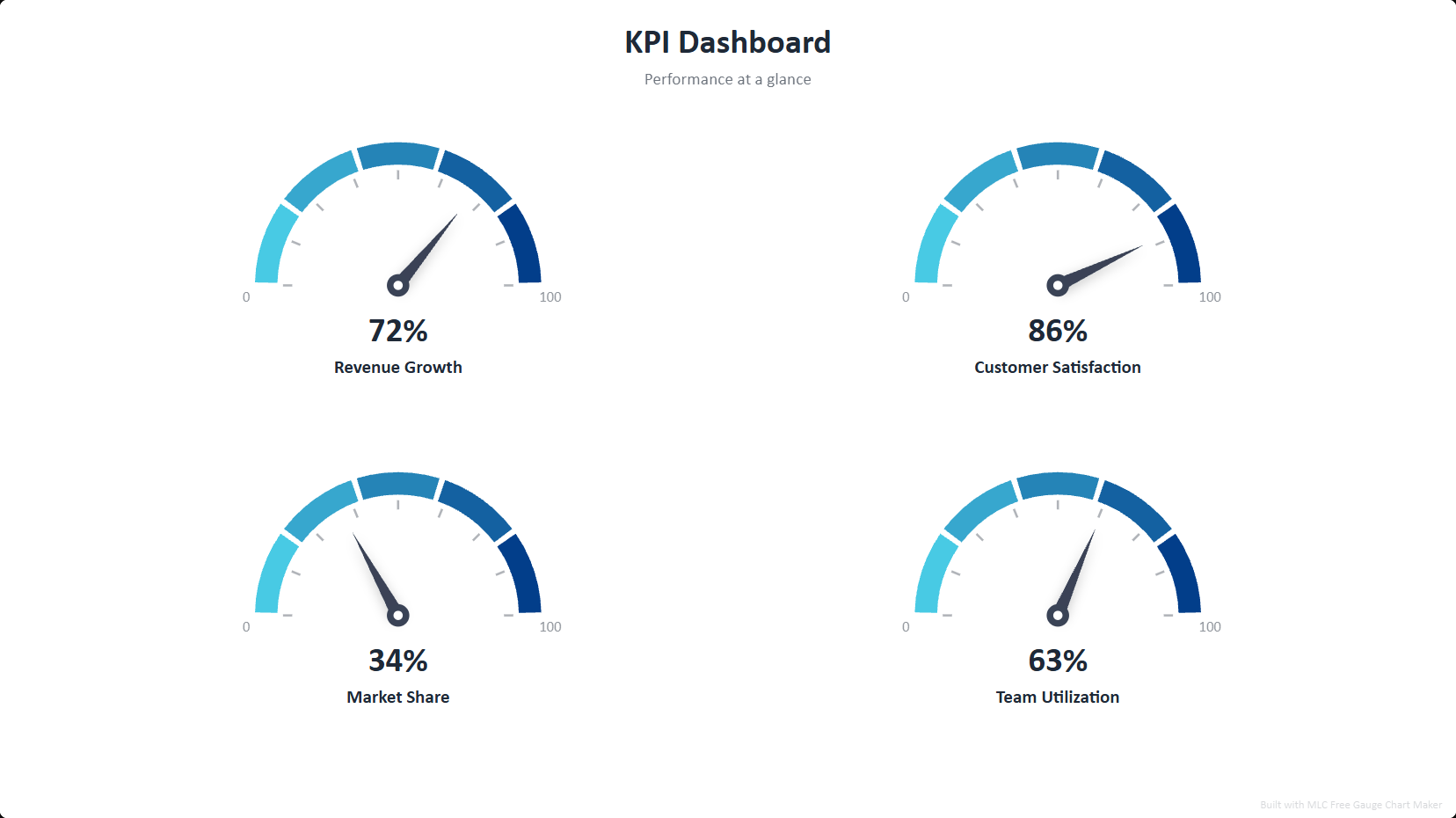
What is a KPI dashboard?
A KPI dashboard shows several key metrics at once, each on a gauge that reads value against its scale — so an audience instantly sees what is on target and what is lagging. Gauge dashboards are common in executive reviews, OKR check-ins and performance reports.
How to use this template
Open the template
Click the button above — the KPI dashboard opens in the editor, already filled in. No signup.
Edit your data
Replace the sample entries with your own; the chart updates live as you type.
Style it
Pick a visual style and color palette to match your deck.
Export to PowerPoint
Download a .pptx with native, editable shapes — or PNG and Excel.
Ready in two minutes
Open the kpi dashboard template, drop in your data, and export a native, editable PowerPoint slide — free, no signup, no watermark.
Open this template →Why export to PowerPoint matters
Most free chart tools give you a flat PNG, or lock PowerPoint export behind a paywall. This template exports real, editable PowerPoint shapes and text — so you can drop the chart straight into your deck and restyle it in PowerPoint, Google Slides or Keynote. That is the difference between a picture and a slide.
Frequently asked questions
A slide with multiple gauge charts, each showing one metric against its min/max scale. This template lays out a ready-made dashboard.
Yes — every gauge exports as native, editable PowerPoint shapes, plus PNG and Excel.
Yes, 100% free, no signup, no watermark.